v2 prioritize isn't large enough

Avatar
  • actualitzat
  • Respost

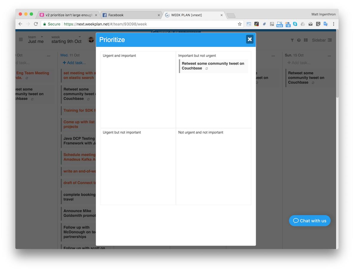
In my workflow, I'd generally try to be looking at the quadrant of things in a given day and in v1, it was possible for the quadrant view to effectively use the full browser.  In v2, it's a modal that only occupies part of the browser.  This, unfortunately, makes me want to stick with v1.


Is it possible to increase the 'quadrant' view shown behind the prioritize link?

App:
Web app
Avatar
Support Team
  • Respost

Hi there,


Thank you for  reaching out.  The issue has been fixed.  If you may  try again please :)


Let us know if there is anything else that we  may assist you with.

Avatar
ingenthr

Hm, I don't seem to see a change yet.  Here's what I'm seeing.  It appears just in the middle of the browser:


It's showing version 2.5.7 in the left sidebar.  Do I not have enough of an update loaded?

Avatar
Ana Loraine
  • Respost

Hi there!


Our apologies if we missed this ticket. 


Please be advised that the updated version has a bigger prioritize section. :)


Avatar
ingenthr

Yep, fixed now.  Thanks!

Avatar
Ana Loraine
Quote from ingenthr

Yep, fixed now.  Thanks!

You are most welcome! :) Please feel free to reach out if you have other questions or concerns. 


Have a great day!