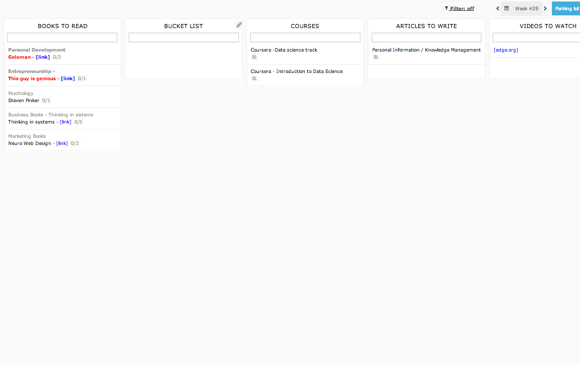
Parking Lot - Wasted space
Hi! Weekplan still working fine and I am starting to really like it :)
There is a lot of wasted space in the parking lot, maybe allow those lists which are outside of the margins to fall down to the second line?

Thanks! :)
There is a lot of wasted space in the parking lot, maybe allow those lists which are outside of the margins to fall down to the second line?

Thanks! :)
App:


Maybe I can find a UI layout that would cater for both. I need to think about it.
2. I noticed that you are using a smaller font than the default one on WeekPlan. Is that because you feel the text is too big?