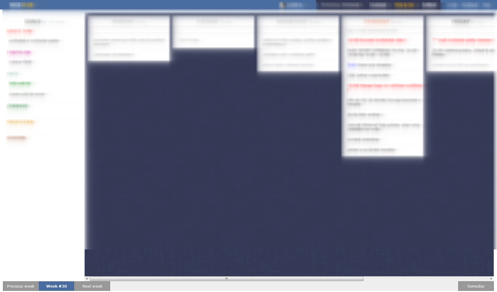
New design: solves nothing , create few more problems
Hi, i dont understand usability of new design. What problem does it actually solve? (1) Most common complain here was that weekend boxes are too small. Solution: now i dont see them at all ( i have to scroll to them) Its completely ruining whole experience when i trie to look at glance on one week. (2) Your previous design was too overcrowded. Solution: lets make 3/4 of screen empty. Thats how looks my weekplan now. About 3 - 5 task a day, everything else is blank. What a waste of space. (3) Someday task are out of sight. Out of sight, out of mind. Before i have cared about the maybe tasks because i have seen them every day, now i can see me forgetting about them in a month. No ability to move task from week to someday is just a bonus to whole situation.
So basically this is my question: what problems does new layout actually solve? And second question: can i have back old interface pls?
Still loves weekplan because of your programming skills but i will repeat myself: you trully need somebody with design skills. To create design is not "lets try this now" game. You have users from all the world (i guess, because i am from Slovakia:) that use your app everyday, you have great system based on great principles of 7 habits. Dont kill it with weak usability and design
App:


