Change the color of Urgent Items

Avatar
  • updated
  • Completed

Hi,


I absolutely love the product and have found my productivity increase so much since implementing the quadrant system. However, I have noticed that I am usually a bit averse to completing tasks that are important and urgent, mostly because the color red. There are many studies that recommend avoidance of the color of red because we often have negative associations with it. Is there any way to customize the color of tasks that are 'urgent'?

App:
Avatar
Aymeric Founder
  • Under review

What color you would choose?

Avatar
Jono Ryan

Thanks for the incredibly fast response, Aymeric!

I think blue would be a pretty happy compromise.

Avatar
Aymeric Founder
Quote from Jono Ryan

Thanks for the incredibly fast response, Aymeric!

I think blue would be a pretty happy compromise.

I am currently working with a user experience expert, I will discuss this with him. Thanks.

Avatar
AST

Yes, that's exactly the reason I very seldom use the urgent button. The red color is much to "heavy". Four "good designed colors" for the four quadrants would be nice.

Avatar
Aymeric Founder
  • Completed

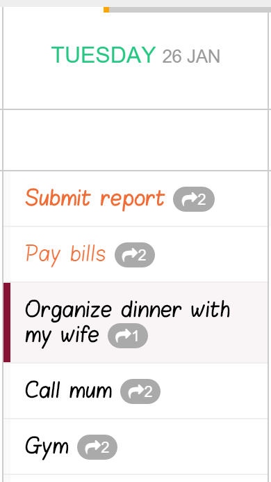
I have experimented with blue for urgent and I don't think blue indicates the urgent aspect well enough, instead I will dim the red a bit: (will appear in next deployment)

Avatar
AST

Great! Much better!