Voorpagina
Knowledge Base
Community Forum
My Tickets
NL
English (EN)
Русский (RU)
Español (ES)
Français (FR)
Deutsch (DE)
Nederlands (NL)
Íslenska (IS)
Eesti (ET)
Українська (UK)
Dansk (DA)
Català (CA)
Polski (PL)
Inloggen / Aanmelden
Voorpagina
Week Plan Software
Ideeën
Make Saturday and Sunday bigger
Aymeric
15 jaar geleden
bijgewerkt
14 jaar geleden
Voltooid
App:
Pinned replies
0
Aymeric
14 jaar geleden
Antwoord
Voltooid
Antwoorden
Link
Reacties
4
Oudste eerst
Nieuwste eerst
Oudste eerst
1
Peter Kučera
14 jaar geleden
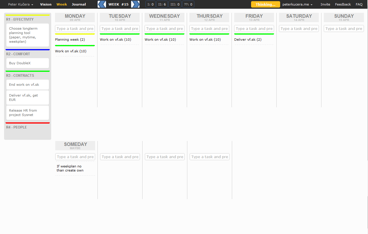
04/09/2012 - I made such a proposal. Like it? What do you think?
.
.
Antwoorden
Link
0
Aymeric
14 jaar geleden
Quote from
Peter Kučera
04/09/2012 - I made such a proposal. Like it? What do you think?
.
.
I have never seen that! Thank you!
I like:
- the loading indicator in the navbar
- the days all side by side but it can cause an issue on smaller screens. My solution would be to use an horizontal scrolling (similar to trello).
- like the grey color instead of the blue background. It goes well with the gold color.
- R1 R2 R3 to be able to simply associate a task to a role "This is my task 2! R1"
- your attempt at better dividing the days (with vertical lines). But I think it can look better, I don't know how.
I feel the topbar is too busy, I think it would be better to have two bars (like trello) to give some space with < Week #51 > in the second bar.
I prefer showing the colors of the role on the side like it is today, it is more subtle.
Antwoorden
Link
0
Peter Kučera
14 jaar geleden
Quote from
Aymeric
I have never seen that! Thank you!
I like:
- the loading indicator in the navbar
- the days all side by side but it can cause an issue on smaller screens. My solution would be to use an horizontal scrolling (similar to trello).
- like the grey color instead of the blue background. It goes well with the gold color.
- R1 R2 R3 to be able to simply associate a task to a role "This is my task 2! R1"
- your attempt at better dividing the days (with vertical lines). But I think it can look better, I don't know how.
I feel the topbar is too busy, I think it would be better to have two bars (like trello) to give some space with < Week #51 > in the second bar.
I prefer showing the colors of the role on the side like it is today, it is more subtle.
I glad to read that some of things you like. Others is quite understandable, this idea is 3 months old and today I moved it again for the better.
Antwoorden
Link
0
Aymeric
14 jaar geleden
Antwoord
Voltooid
Antwoorden
Link
Sign in to leave a comment
Bevestig