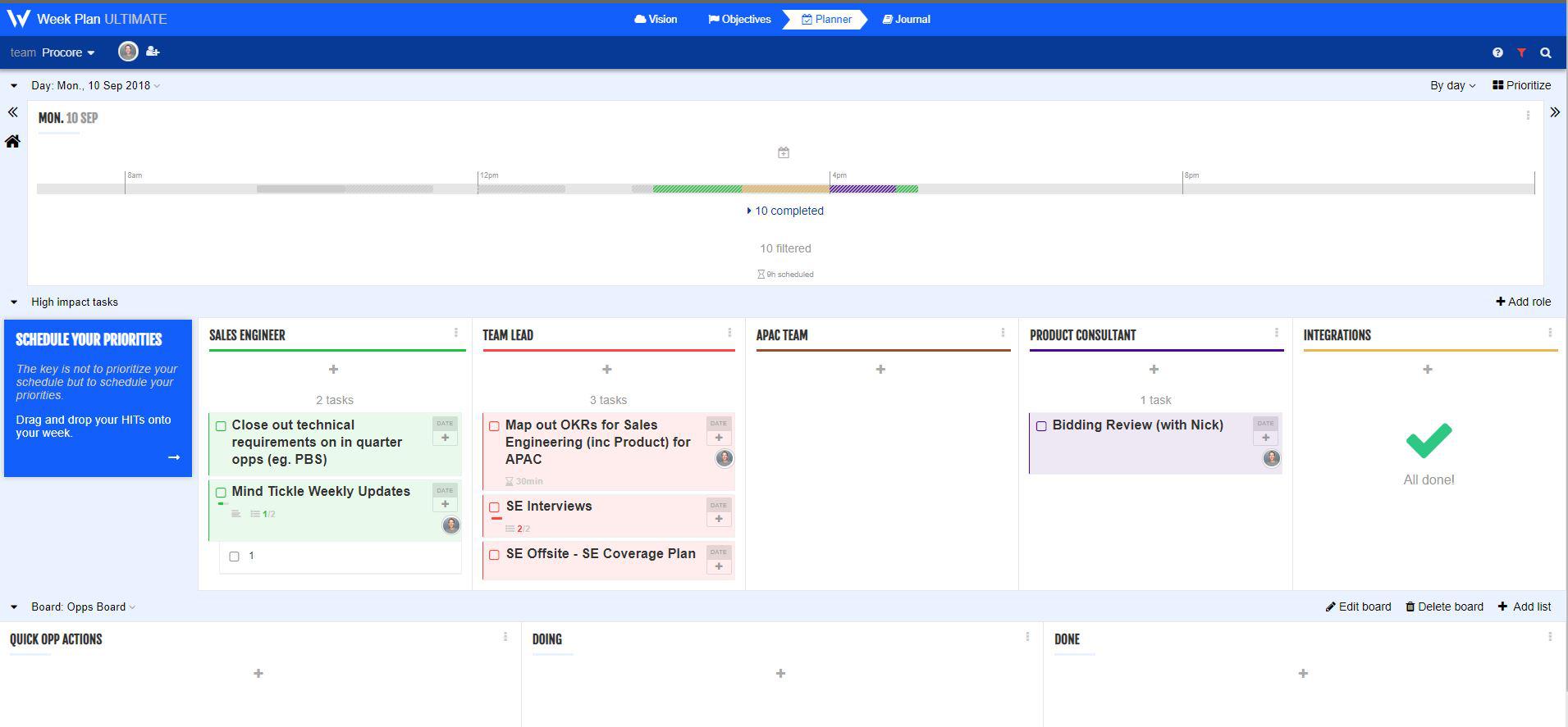
Planner View UX Request - Timebar still shows when collapsing calendar section.
Hi
I often have a very busy calendar resulting in a long list of appointments/meetings in the Planner view of Week Plan. This becomes difficult (and in some cases impossible) to drag items from High Impact Tasks section to the calendar to schedule them into my day/week.
What would be a great solution is that when collapsing the calendar section in the Planner view it still shows the horizontal time bar. This way I can hide the long list of appointments I have but retain the timebar to drag my HITs into.
Attached is a screen shot to show what this may look like. Note, the calendar section is not collapsed, but I have marked all the tasks complete to try and replicate what I am imagining in this solution would look like.
I would be keep to see if other agree with this idea as well.


Thanks Robert, we will introduce a new way to set time, that shows the available time slots for the day, like cloud Outlook.