Planner - are others ticking off meetings?

Avatar
  • updated
  • Under review

Hi


Just wanted to see what others are doing with respect the 'ticking off' meetings that have synced from G-Cal/Outlook to the Planner in Week Plan?


With the work I do I have many days which can be packed with meetings. This can mean that I have a huge list of items on the Week Plan Planner and I have to scroll a lot to get to my HIT and Board areas. Due to this I am tempted to tick all meetings that have synced from G-Cal/Outlook so this list only shows HIT and other priority items. While this means I would not be able to use Week Plan Planner view my appointments/schedule list for the day (and on that note I think the UX of the way this displays could be improved)  I still get the horizontal timebar. 


How are others in this situation using Work Plan?


App:
Web app
Avatar
robert hudman

Ping! :)


Just wanted to see if any other users had thoughts here?

Avatar
Aymeric Founder
  • Under review

Hi Robert,


1. Can you see how we could improve the display of the event list? I am open to suggestions


2. I am considering splitting the week and boards in two separate pages, and put HITs on the side instead of under.

Avatar
robert hudman

Hi Aymeric


Thanks for your response. 


Firstly, can you let me know if the intent/best practice of sync'd calendar events on the Week Plan Planner is to be ticked off? And did you envisage that these get ticked off as they occur? I just want to make sure I am using the Planner in the best way to get the most from it. 


As far as event list display, I would really like to have some more options on how to display, some thoughts are:

  • Display options for Calendar/Slots view and Schedule view (much like Google Calendar). This mirrors the 7 Habits suggested layout better so you can see free time slots more easily (although I don't want to loose the timeline bar)
  • Options to resize the size of the task/appointment cards. 
  • Generally the scale of the objects in the planner view is quite large. This means that (even with zoom down to 90% on a widescreen monitor) I am having to do a fair bit of scrolling to see everything. 
  • I like the schedule, HITs and Boards being on the same view myself, more so some layout adjustments. 
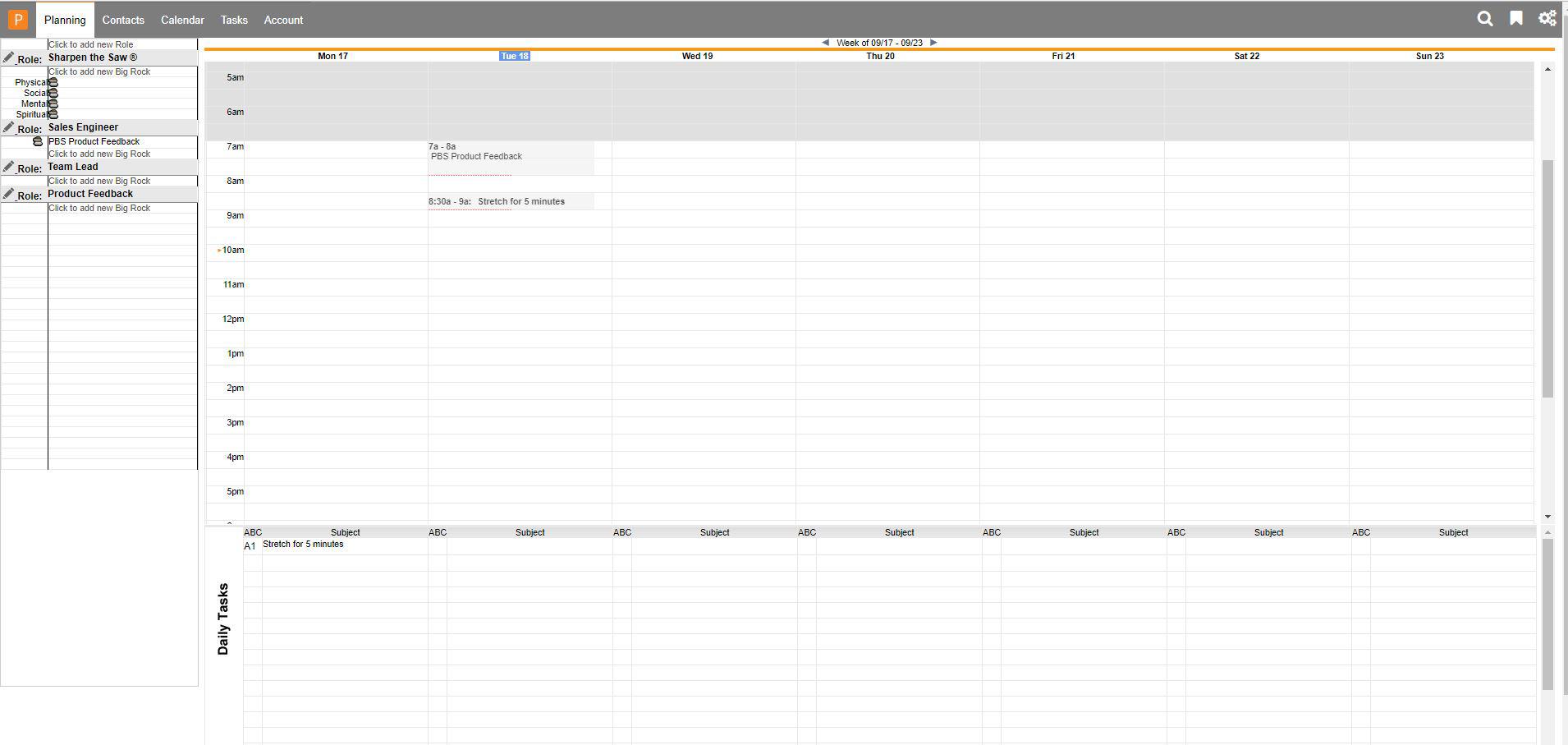
  •  I like the idea of the HITs to the side, screen shot below of PlanPlus Online which uses this layout and works well. 


Avatar
Aymeric Founder
Quote from robert hudman

Hi Aymeric


Thanks for your response. 


Firstly, can you let me know if the intent/best practice of sync'd calendar events on the Week Plan Planner is to be ticked off? And did you envisage that these get ticked off as they occur? I just want to make sure I am using the Planner in the best way to get the most from it. 


As far as event list display, I would really like to have some more options on how to display, some thoughts are:

  • Display options for Calendar/Slots view and Schedule view (much like Google Calendar). This mirrors the 7 Habits suggested layout better so you can see free time slots more easily (although I don't want to loose the timeline bar)
  • Options to resize the size of the task/appointment cards. 
  • Generally the scale of the objects in the planner view is quite large. This means that (even with zoom down to 90% on a widescreen monitor) I am having to do a fair bit of scrolling to see everything. 
  • I like the schedule, HITs and Boards being on the same view myself, more so some layout adjustments. 
  •  I like the idea of the HITs to the side, screen shot below of PlanPlus Online which uses this layout and works well. 


Thanks Robert, the lack of a calendar view has always been a controversial position we took. Originally Week Plan was mainly dealing with tasks, but later introduced events. For most people, the calendar view is wasteful because it shows a lot of whitespace. The timebar we have is meant to be the right compromise between not wasting space and still be able to see the available time in your schedule.


Also, as you can see in PlanPlus, they have some vertical scrolling for the calendar. We can't introduce vertical scrolling like that because we already have horizontal scrolling for hits and boards.


Having both vertical and horizontal scrolling would make the whole thing confusing. If we split Week and Boards into two separate pages, and put the HITs on the side, then we would be able to introduce vertical scrolling for the week view.  


And to answer your other question, yes the events are meant to be ticked off like the tasks to keep track of which meetings you actually went to.

Avatar
robert hudman

Thanks for the quick response. 


For me, having the HITs, Boards and Calendar/schedule on the one page is the best mix...and in truth a big reason for preferring Week Plan. 


I don't quite understand the scrolling issue, as I only see vertical scrolling on the Planner view. Maybe you can explain this with some visual examples. 

Avatar
Aymeric Founder
Quote from robert hudman

Thanks for the quick response. 


For me, having the HITs, Boards and Calendar/schedule on the one page is the best mix...and in truth a big reason for preferring Week Plan. 


I don't quite understand the scrolling issue, as I only see vertical scrolling on the Planner view. Maybe you can explain this with some visual examples. 

I am talking about the inner scrollbars (as opposed to the whole page scrollbar).


When you have more than 8 lists or roles, you can scroll horizontally within the page.

Avatar
robert hudman

Oh ok, yeah I only have four roles or lists

I think if you have more than that its in need of review/refinement


Could you consider capping it at a max amount to give you more development flexibility?


On a side note - happy to run on a zoom/GTM session to go through some idea 1:1 if you would like. 

Avatar
Aymeric Founder
Quote from robert hudman

Oh ok, yeah I only have four roles or lists

I think if you have more than that its in need of review/refinement


Could you consider capping it at a max amount to give you more development flexibility?


On a side note - happy to run on a zoom/GTM session to go through some idea 1:1 if you would like. 

Yes I would love to chat with you. Please pick a time slot in my calendar that works for you here: https://calendar.google.com/calendar/selfsched?sstoken=UUc5eW9yeGNrbDZxfGRlZmF1bHR8YmM5M2E1YThlZGU1ZDMwZmFiMTMzYjRlZWZlN2MzMGE