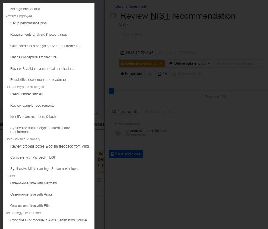
The list of high impact tasks is too long and doesn't appear to have a scroll option
When I add a new task in the week view and then use the detail properties pane to align it to an objective and high-impact task, the high-impact task list includes tasks related to *all* objectives rather than just the selected objective. This makes the high-impact tasks list too long to display on the screen and there doesn't appear to be a way to scroll the list to get to the specific task I wish to select. Here's picture where you can see for the "Review NIST recommendation" task, I've selected "Define data encryption" as the objective, but the list of High-Impact Tasks still shows all of my tasks and scrolls off the bottom of the screen.


Hi,
Thank you for the feedback.
Our team is working on improving the interface of the app. Particularly, making it easier to move around the task and creating more space on viewing long lists. The update will be released very soon.