Roll. Back. Please.

Avatar
  • updated
  • Under review

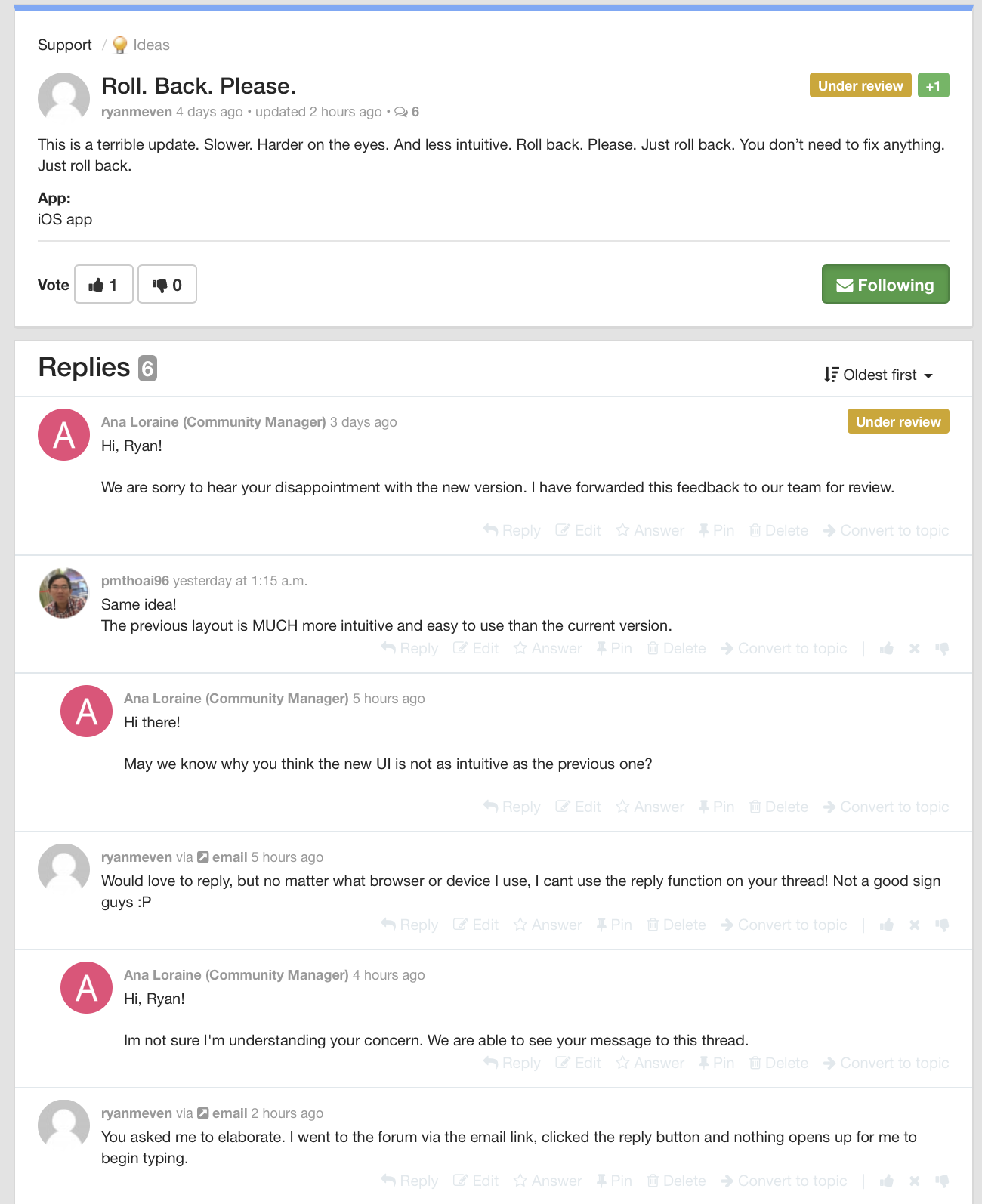
This is a terrible update. Slower. Harder on the eyes. And less intuitive. Roll back. Please. Just roll back. You don’t need to fix anything. Just roll back.

App:
iOS app
Avatar
Ana Loraine
  • Under review

Hi, Ryan!

We are sorry to hear your disappointment with the new version. I have forwarded this feedback to our team for review.

Avatar
pmthoai96

Same idea!

The previous layout is MUCH more intuitive and easy to use than the current version.

Avatar
Ana Loraine
Quote from pmthoai96

Same idea!

The previous layout is MUCH more intuitive and easy to use than the current version.

Hi there! 

May we know why you think the new UI is not as intuitive as the previous one?

Avatar
ryanmeven
Would love to reply, but no matter what browser or device I use, I cant use the reply function on your thread! Not a good sign guys :P
Avatar
Ana Loraine
Quote from ryanmeven
Would love to reply, but no matter what browser or device I use, I cant use the reply function on your thread! Not a good sign guys :P

Hi, Ryan!

Im not sure I'm understanding your concern. We are able to see your message to this thread.

Avatar
ryanmeven
You asked me to elaborate. I went to the forum via the email link, clicked the reply button and nothing opens up for me to begin typing. 
Avatar
Ana Loraine
  • Under review
Quote from ryanmeven
You asked me to elaborate. I went to the forum via the email link, clicked the reply button and nothing opens up for me to begin typing. 

Hi, Ryan!

Your response to this message  will appear on the forum like your previous ones. 
Avatar
ryanmeven
Wow. That is an interesting feature. To be able to reply to a thread via email and have it post unknowingly, but not be able to click reply and input text within a thread... yikes.

Anyway, that right there is an example of lacking an intuitive interface. The old version of the IOS app of weekplan you could

1. The date you would tap and adjust which week or month you are in is now the same text as the rest do the days whereas it was by itself at the top (as a fixed header I believe) which was quicker to ID.
2. Tapping items has a bit of delay/lag before the app responds.
3. You can’t drag and drop any more
4. You can’t drag the screen down to refresh
5. Initial load time is mega slow, and connection dependent now. 

That’s all I can recall for now. I would think some of this would have been ID’d In testing phases. Just my experience. Thanks.