I hate this new interface! All my previous tasks have vanished so now I have no idea what I had on!!! Thanks a lot 😡

App:
iOS app

Hi, Chris!
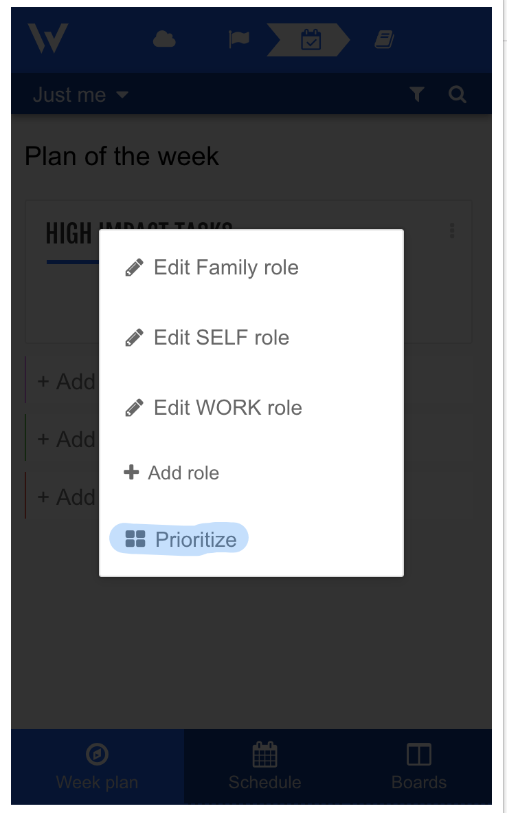
There's a prioritize function for the HIT- Roles section for both Chrome extension and web version.
May we know if you tried using this? If so, we'd be happy to hear your thoughts about it.
Viewing the roles at the bottom of the screen was a key feature!! I cannot use the new layout!!! Could you please revert this as soon as possible OR make it an optional view that we can change?

Viewing the roles at the bottom of the screen was a key feature!! I cannot use the new layout!!! Could you please revert this as soon as possible OR make it an optional view that we can change?
Hi, Jomar!
We took it out temporarily until we can publish the new iOS and Android versions, the Roles board introduces a change that needs to be present on the front end. We are basically waiting on Apple.

I'm still getting accustomed to the new layout, and am open to the time that it may take for the changes to become integrated into my scheduling process.
However, there were some features on the iphone app that I really miss. First, graphically, it was far easier to visually identify task and role in the previous version. The small, outlined square to the left is illegible and at times confusing as to what role it signifies. Second, it was far easier to integrate other calendars previously. Now I am forced to go online, which I hardly used, to sync google and outlook. At present, even with them synced, my outlook is not pushing into week plan, which is annoying. Third, when I schedule a new task, I can't set the time. I have to enter the task, then click it again to get to a calendar that has another button that allows me to schedule the start. I have to then hunt for another button that allows me to set the duration. This is too confusing and takes far too much time for a planning app intended to aid in time management.
As a designer, I appreciate the attempt to enhance how objectives and key results were prioritized and managed. However, as with so many artifacts or services, it would be nice if those changes could be made without completely altering what was a successful interface. This increases a learning curve in a world that demands we continue to learn more than the time we have available.


Although I do understand that planning is a personal issue so everyone does it a little different, I just wanted to say that I like to new layout.
I haven't been using WeekPlan anymore, as the HIT thing was (in my opinion) too central. I have to get done lots of things, most recurring, most not HIT. But, in weekplan I just couldn't get them organized. Now, with HITs put at the side line (for some really important long term stay-up-to-it tasks), I can concentrate on all the lists and tasks I have to juggle - that is just great.