Is there a chance that roles will be broken out at the bottom again?
Or do we have to just accept the change / move on?

As much as you can as guess, but aim to complete 100% of them most of the time. If you constantly fail at completing them all, you need to lower how many you commit to per week
Sometimes, HITs are impeded due to conditions outside of one's control--weather, dependencies on other people, etc. Nonetheless, the should still be at the top of the board, and still have a full view.


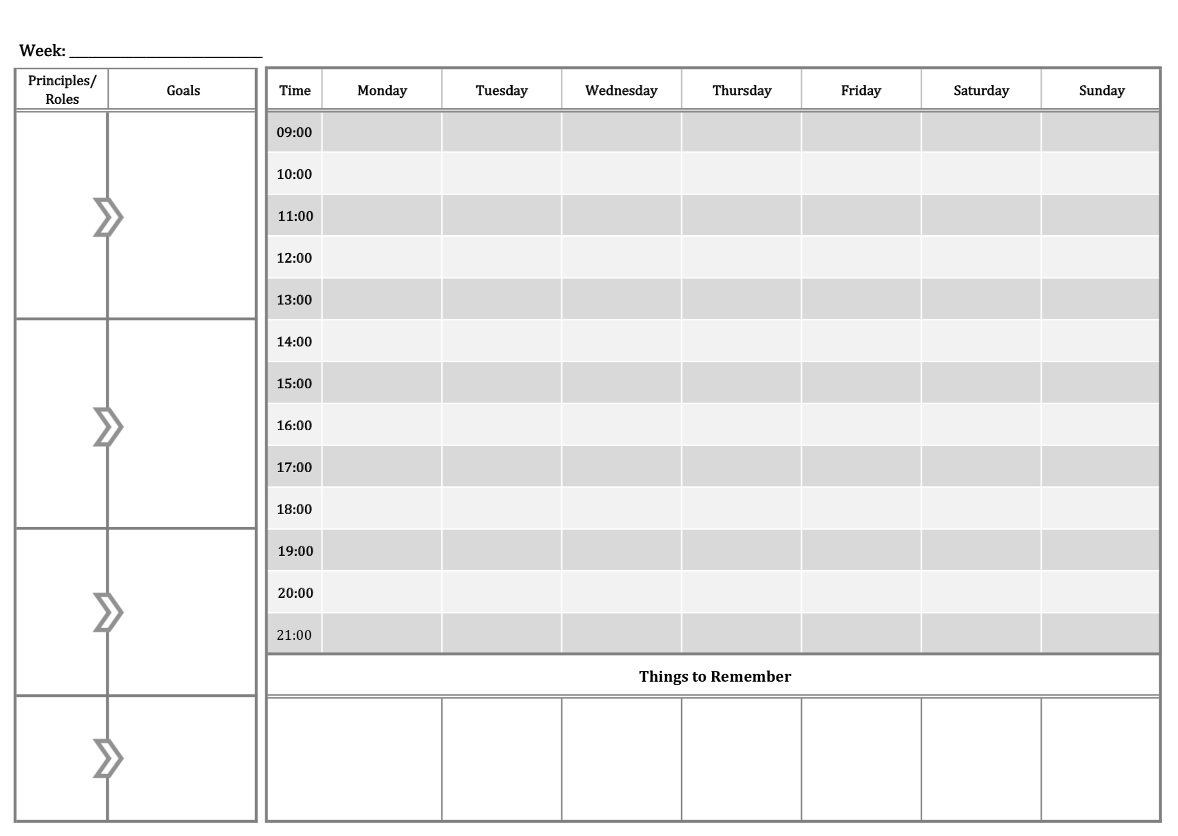
Here's a paper version I was using previously until I discovered the awesome Week Plan. The intent is to see everything on one screen (without scrolling, without forgetting anything). I understand the intent to prioritise the HITs better, but in any week I would have about 10-15, which makes the left pane slightly unmanageable.

This is the right layout which Week Plan closely matches. Is your problem that a long list of HITs is difficult to manage and therefore you would like them to be split by role? Or is it that you have to scroll?

Yes, the list of HITs (about 10-15 a week) are less visible on the new layout. On the other hand, there's a lot of empty space at the bottom of my schedule (where the roles used to be), as I try to only have 4-5 tasks daily. The schedule usually takes less than the top half of my screen.
Thus, it would be ideal to have them (i) split by role, and (ii) at the bottom to optimise screen real estate (and thus not have to scroll).
I see, I need to optimise for the most important scenario here. Having the Plan of the Week clearly visible, instead of catering for people with fewer tasks in their schedule. My assumption is that people with busy schedules would benefit the most off the Plan of the Week.


Wouldn't people with busy schedules thus also have a lot of tasks in the left pane, and thus need to scroll?
How many daily tasks do users have on average?
No I don't think they would have lots of tasks on the left. If you are already busy, you can potentially complete fewer HITs rather than more.
I don't have the daily tasks average here, but assuming someone has 5 tasks, you'd already not have much space under the schedule and you would have to scroll to see your HITs


Also, perhaps it would be useful to understand how users use the product. There seems to be a lot of dissatisfaction with the new layout, thought it might just be the minority of users.
A lot of dissatisfaction comes from a few things:
- We should have better educated the users on the changes rather than simply updating the version without notification or tutorial
- Previously many users were using the HITs section as a backlog instead of a week list. The name of the product is called Week Plan, and I believe this Plan of the Week is the essence of Week Plan. If people want a backlog grouped by role, they can still do it using the board. Again, it is an education problem.
- There are some minor quirks with the Plan of the Week, like the sorting isn't quite right, and some people would prefer to see the HITs grouped by role.
I am still trying to understand if there is another reason why people are disgruntled.
What if we introduce a way to see all your backlog grouped by role, a bit like a user suggested, you would have three links: "Schedule Boards Roles"
Like the Boards view, you would be able to see your Schedule on the same page as the Roles board.
We would however keep the Plan of the Week as it is.
Would that solve the contention?