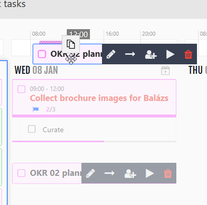
Set time by dragging task to the timeline UI problem

Hi,
as you can see some of the UI elements are getting in the way of setting up time and using WeekPlan.
When I drag any task and try to setup time by dragging it, that copy icon(unnecessary) is blocking the view of the timeline so I can't see the numbers. And also the editing buttons are blocking the view of the title of the task.
I like this program, it helps me a lot, however in the past few months I constantly feel that the UI changes are random, without purpose and meaning, and getting in the way of using Weekplan(both windows and Android version).
I hope you can fix these problems asap and do some better planning and design for UI improvements.
Thanks!
Kuidas te hindaksite meie klienditeenindust?
Satisfaction mark by benjamin@hypershade net 6 aastat tagasi
Add a comment about quality of support you received (optional):


Thanks for your feedback.
We are now hiding the task toolbar during the drag to address some of your feedback. It will be available during our next deployment.
The "copy" icon you see comes from Microsoft Edge. We are not sure how to remove it at this stage.