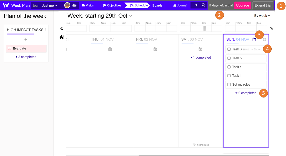
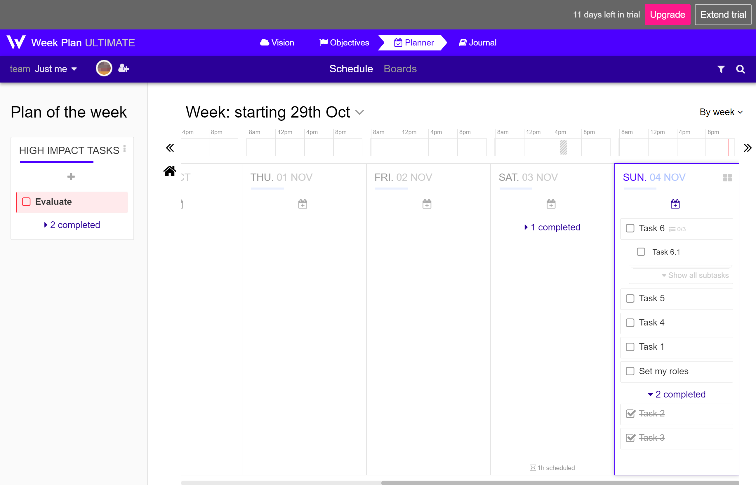
Improve use of space

Weekplan works OK on a big monitor, but it's pretty frustrating on my 12" laptop screen due to some inefficiencies in the use of space. I think there are several opportunities to improve without affecting usability or making the interface too cluttered.
- Collapse the two (three in trial mode) top bars into a single bar. Even on my small screen, each bar is mostly empty space.
- Remove excess whitespace between the top bar and main content.
- Move the "+" task button so that it's between the date and the prioritize button. The current design dedicates a lot of vertical space to this tiny button and I don't think this is necessary for functionality.
- Fully collapse subtasks in the calendar view and move the "v Show" button next to the parent task. On second thought, you could even eliminate the "v Show" button entirely and make it so that clicking on the subtask count itself toggles subtask visibility. Ideally, the UI would remember the subtask state (collapsed or expanded) so that the user can keep subtasks visible if desired.
- Collapse completed tasks by default. Completed tasks are not important, so they shouldn't be so prominently featured, but should still be easy to access if necessary. The current workaround (filtering for incomplete tasks) is not very convenient.
As others have mentioned before, I'd also really like to be able to see the whole week without scrolling, but this seems impossible if the "Plan of the week" remains a sidebar.
The 1st image is a quick mockup that shows my ideas and the 2nd image is the current design.
App:
Web app

Hi,
We are currently working on a redesign that will hopefully help with some of your feedback.
Also we might make the Plan of the Week collapsable. We are not sure yet, because it is the core piece of Week Plan, so it doesnt really make sense to hide it.