colours in week view
hi there,
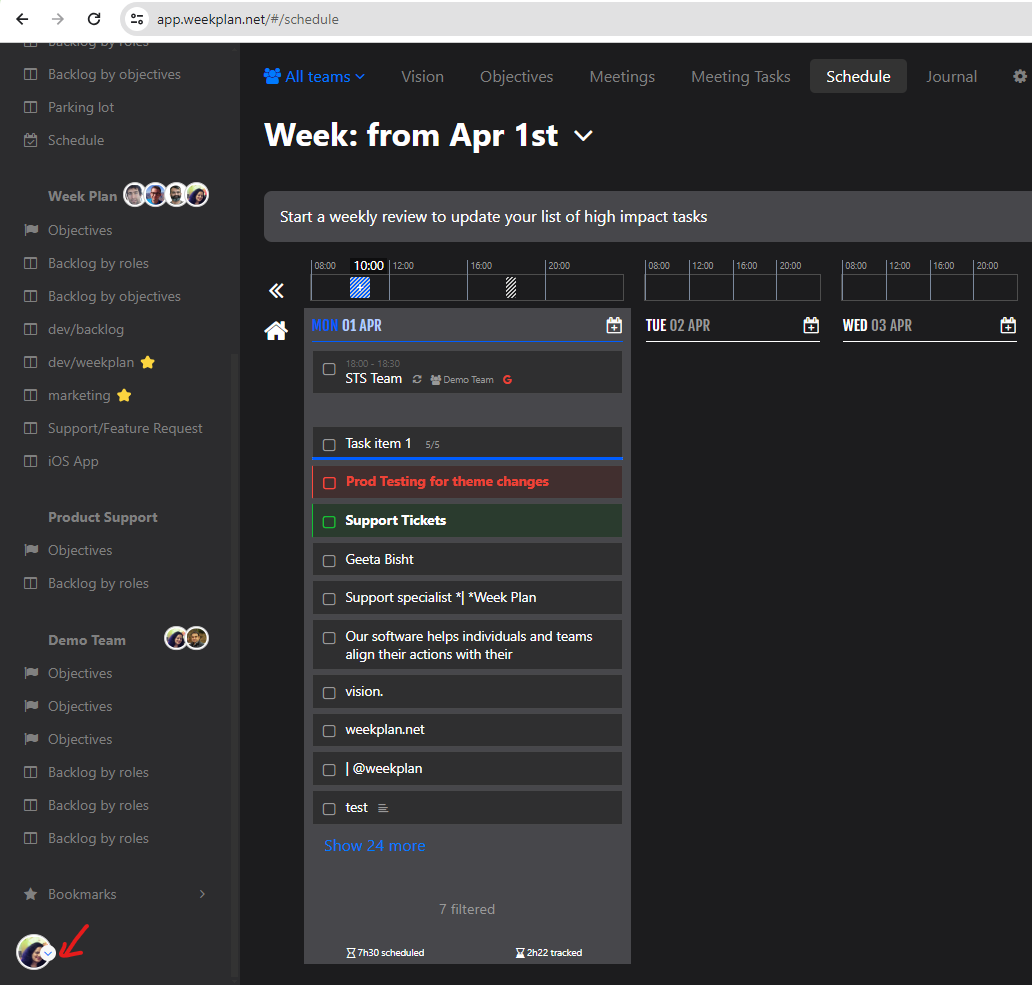
I noticed that you have made today some changes which affected colour coding of the week view.
it all used to be readable before. I mean that cells were filled with colour inside. now only the borders have different colours.
as the result all view week looks almost the same.
any ideas why have you made something looking much worse?
all the best,
antoni


Hi Antoni,
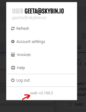
Thank you for reporting the issues. We've introduced a dark theme that you can now switch to from the preferences section of the account settings page.
We've addressed the missing background for the current day in the light theme. This fix will be deployed shortly and should be available within the next few hours.
Thank you once again for reporting these issues and for your valuable feedback. If you notice any further UI enhancements or issues, please feel free to share them with us. Your feedback is greatly appreciated!
Regards,
Geeta
Support Team | Week Plan