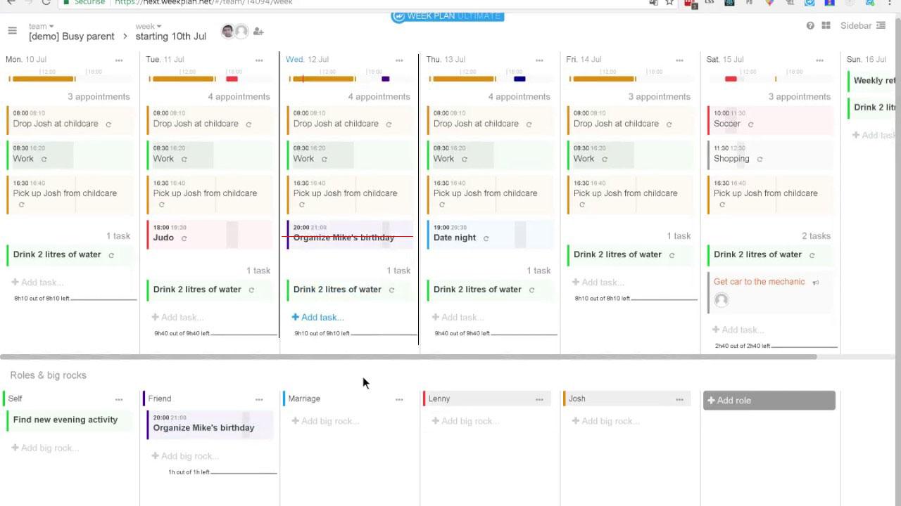

Here it is as I'd like to see it: highlighted current day and time. This way I can easily focus on the current task/time. It's good to have the current day highlighted as well since if I have may tasks in the day and scroll down I don't see the blue colour of the current weekday.

For me, if the time of the day selection for a task is made simpler, that is enough. Both the time slider and text box currently are complicated. Drop downs won't help either. Some better UI has to be there. Perhaps clicking on a clock face and selecting hour first, and if I want, then selecting minute too or saving right there. Or something simple & intuitive like that. Current way is like typing on a 1970 main frame green screen to enter data.

Hi there!
Thank you for your suggestion.
May we ask where you think a horizontal time line should be placed?
Here it is as I'd like to see it: highlighted current day and time. This way I can easily focus on the current task/time. It's good to have the current day highlighted as well since if I have may tasks in the day and scroll down I don't see the blue colour of the current weekday.
Hi there!
We appreciate both of your insights.
Good point! I will share this with the entire team to consider on the upcoming update.
Meanwhile, we'll wait if other users will also votes on this. :)