colors too strong- thumbs up for working on improving the app!

new version 3.Jajnuary: the blue /red an shiny shadows for important/ urgent tasks are too much for me ...nice to navigate to next week by one cklick! Thanks for always working on improvement!
App:


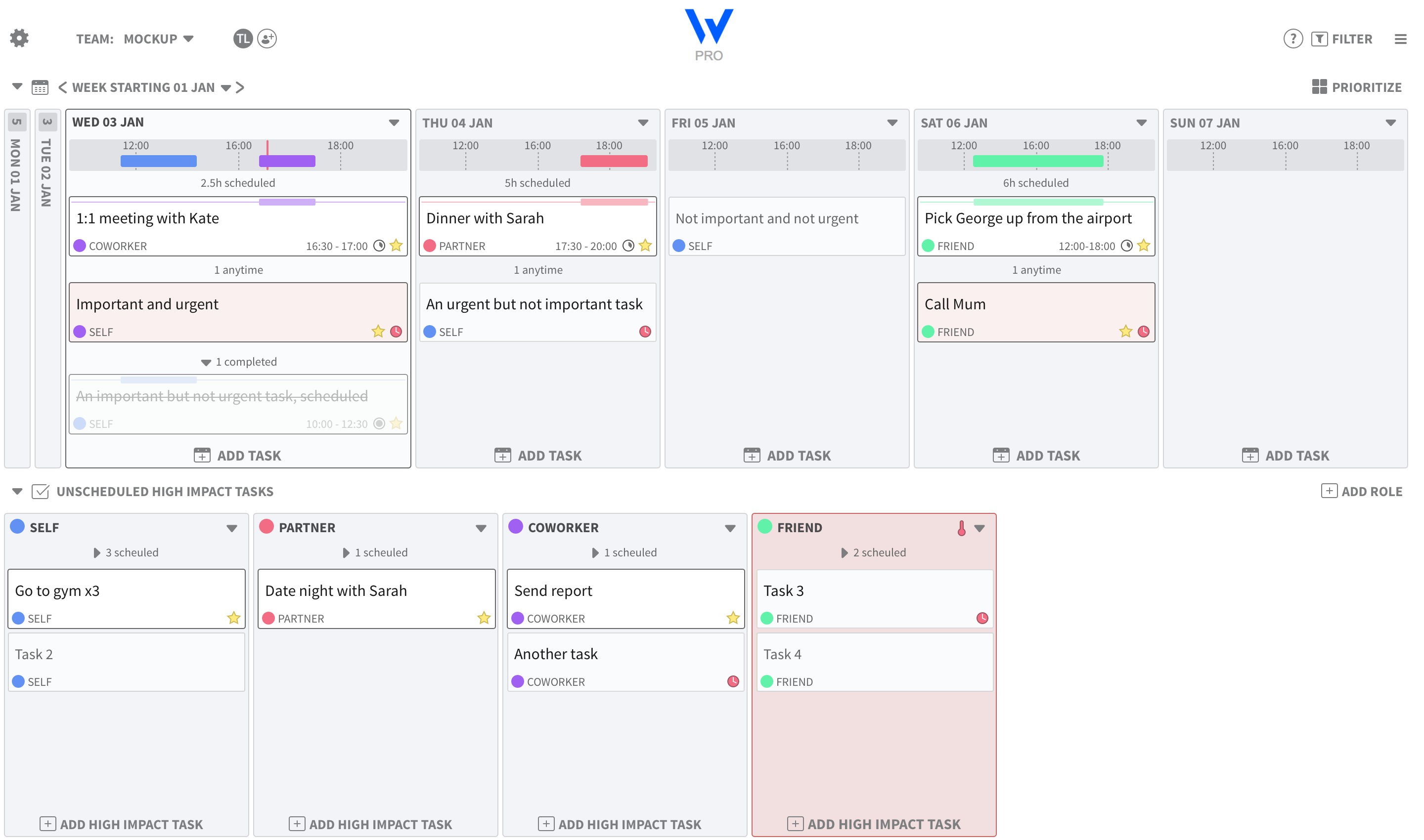

Agree. Latest design is quite difficult to read (colours, weights, fonts)