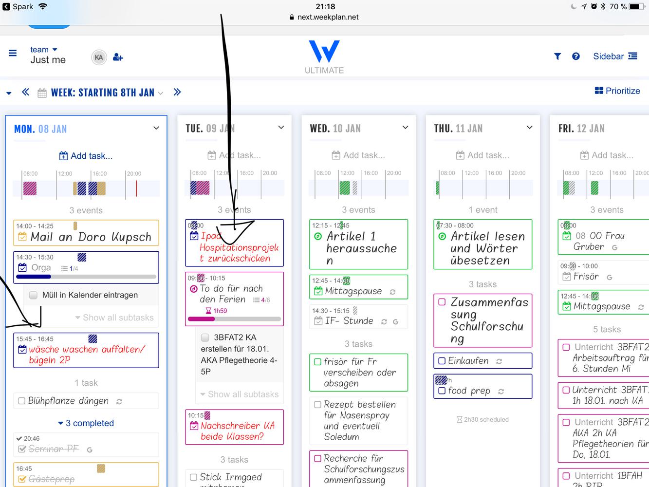
red color
the red color of urgent tasks is still too unpleasant for human eyes, still too distracting....
the red color of urgent tasks is still too unpleasant for human eyes, still too distracting....


Hi, Kamut!
Thank you for your clarification.
I also shared your feedback with the team for further review.


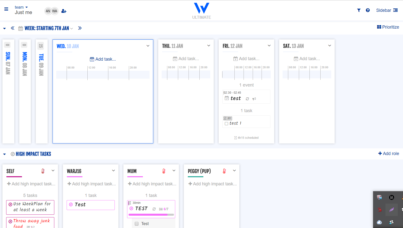
Kamut, is the font (for the headers -- day names, etc.) the same on your iPad and your Mac? I'm using a Windows PC and have a completely different (horrible) font showing up. I want what you've got!
Hi Kathrjeff!
You should be able to change the font through the account settings in your web app.

Hi, Ana. I'm not talking about the font used for tasks (which I know can be changed). I'm talking about the header font (the one that says Week: Starting January 8th, Tue. 09 Jan, Role names, Parking Lot board labels, etc. Thank you for responding, though. Mine is very different than what Kamut's screenshot shows. It's blocky and difficult on the eyes.

Hi,
Thank you for your clarification.
It looks the same on my end though.
Mac:
Windows:

Kamut's shared image:


Hi,
Thank you for getting back to us and for checking the app again on your end.
Please feel free to reach out if you have other questions or concerns.
Have a great day!
Hi, Kamut!
Thank you for your feedback.
May we ask if this is what you're referring to?