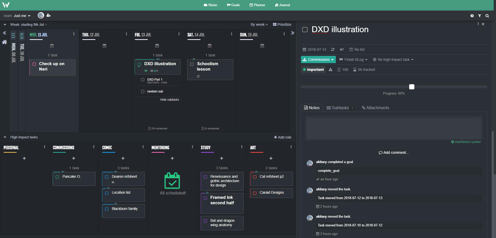
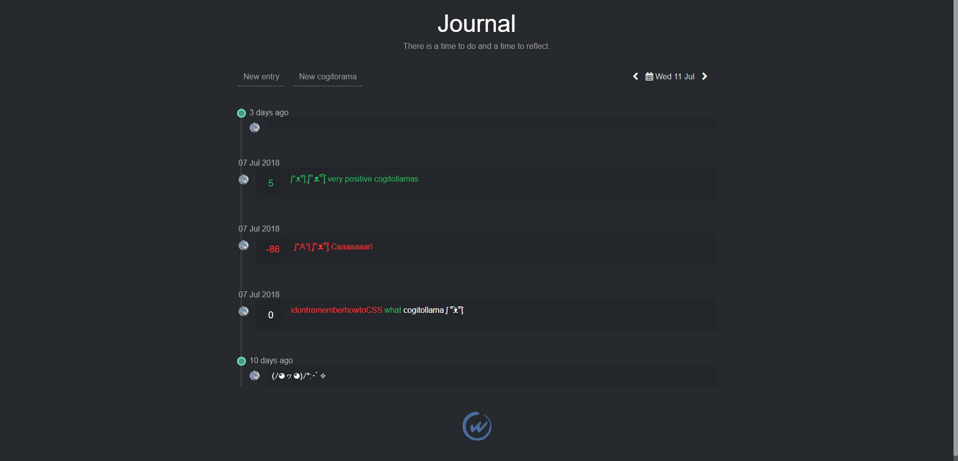
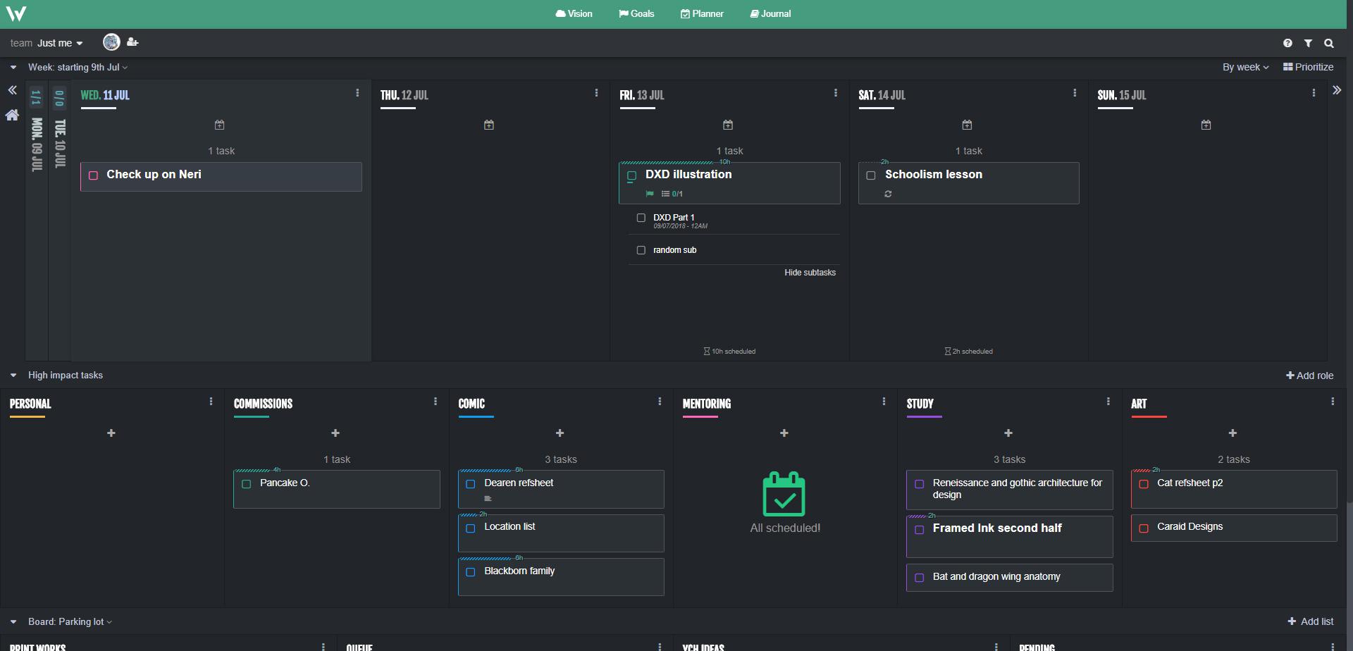
Working dark theme for Chrome users (night mode suggestion)
Custom CSS Style for Week plan:
https://userstyles.org/styles/162389/sleek-plan-a-week-plan-net-night-mode
While this CSS is functional for the current version of the time of posting, I would love to see an official night mode in a similar fashion.
Because the white base theme is very pretty, but might as well be a supernova blasting off at full power piercing our eyesights into Oblivion, especially at late work hours. This stops me and probably many others from ever using the app as it is literally and without exaggeration hurtful to our eyes to look at; like trying to work staring into a lit up torchlight.

 by the way, + + + + + + + can be spammed for ridiculous points or empty messages


Hi there,
We're thrilled to announce the arrival of our long-awaited dark theme feature!
💡 In response to your requests, we've implemented a sleek, stylish, and eye-friendly dark theme option for our platform.
🌙 Whether you're burning the midnight oil or simply prefer a darker aesthetic, this feature is designed to enhance your experience and reduce eye strain during those late-night sessions.
🖤 Embrace the darkness and switch to our new dark theme today! Simply navigate to your account settings page and select the dark theme option from the Preferences section to enjoy a new level of visual comfort.
🚀 Explore the depths of our platform in style with the dark theme – your eyes will thank you!
Happy browsing! 🌟
Regards,
Support Team | Week Plan