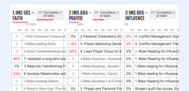
objectives New List is hard to read
There has been a change of how the objectives are listed. I honestly like how it use to be in the first place where we could hide the high impact task and it was just one big list that could be open and closed. I can't read what I wrote down.

App:


Hi this is a bug, they should show one of top of the other... We will look into this